
Comparison ad examples
Two choices. A few clear differences. Use a comparison when the customer needs help understanding what changes with your product.
12 examples · 12 brands
Explore the selectionSelected ads
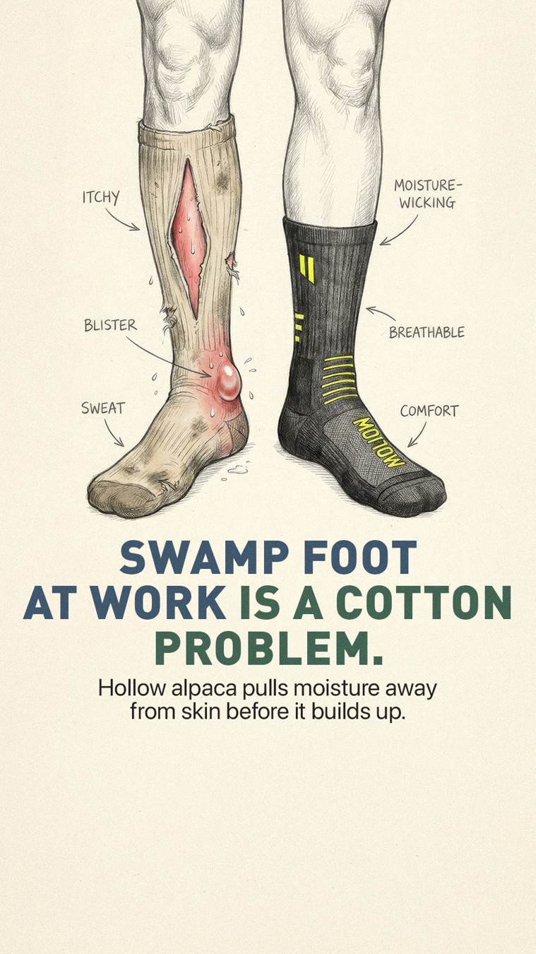

Hollow Alpaca Socks
Us vs. Them


Billo
Us vs. Them
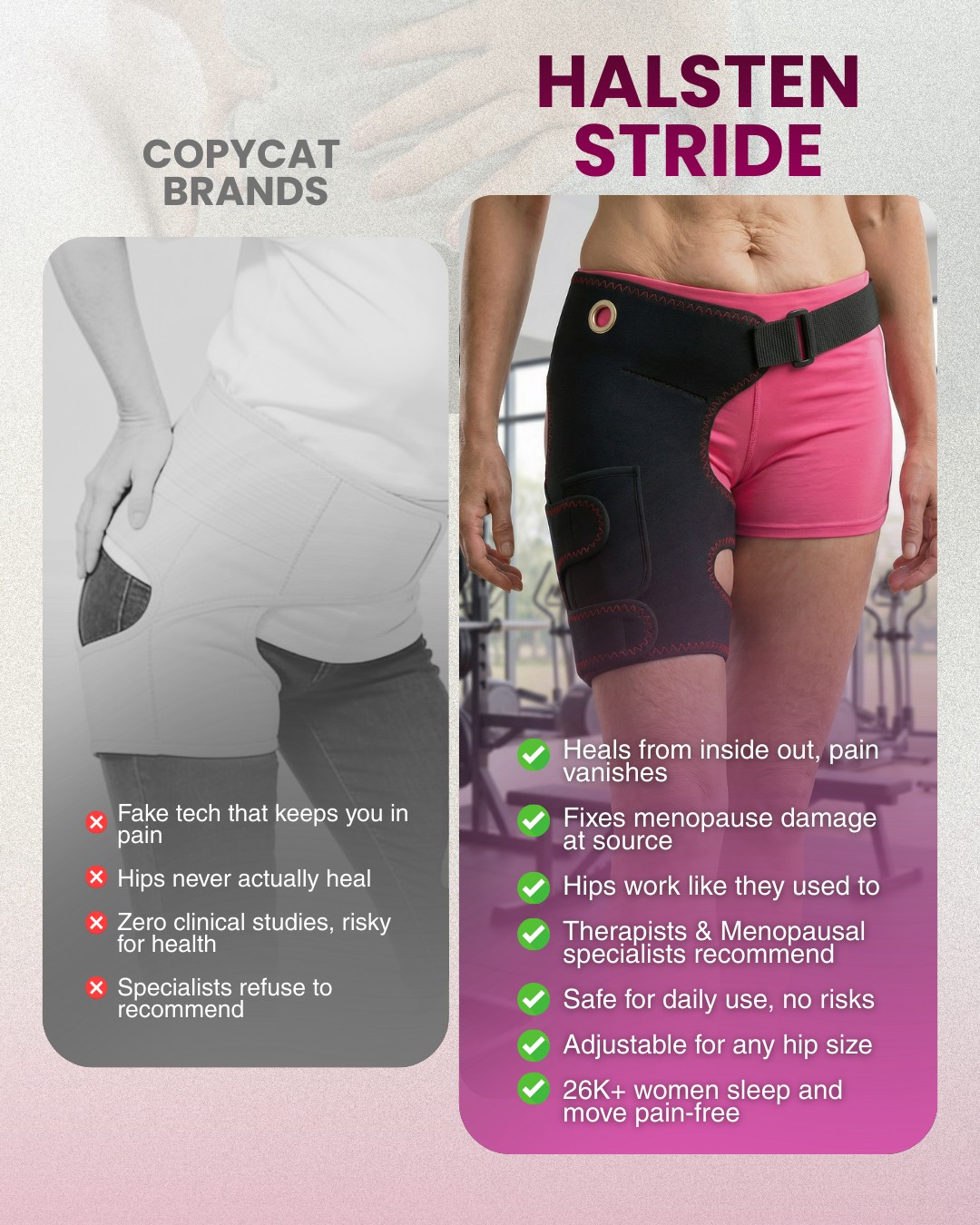

Halsten
Us vs. Them


IM8
Us vs. Them
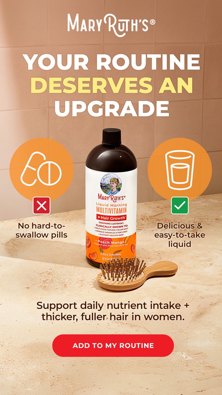

MaryRuth's
Us vs. Them
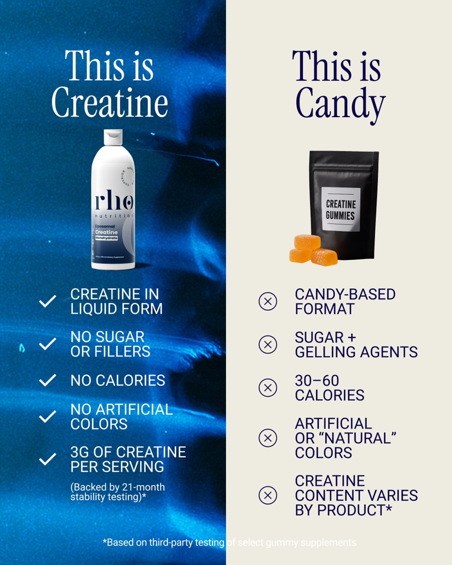

Rho Nutrition
Us vs. Them
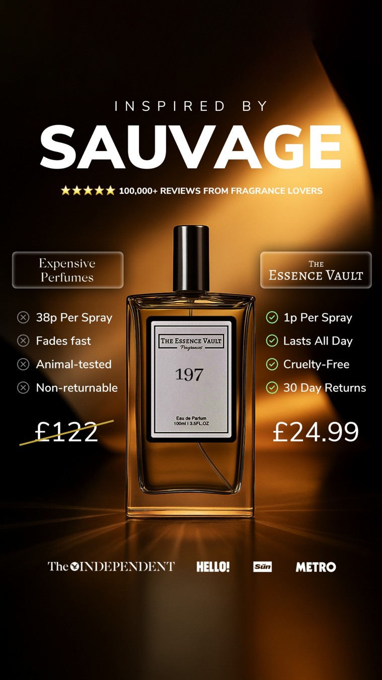

The Essence Vault
Us vs. Them
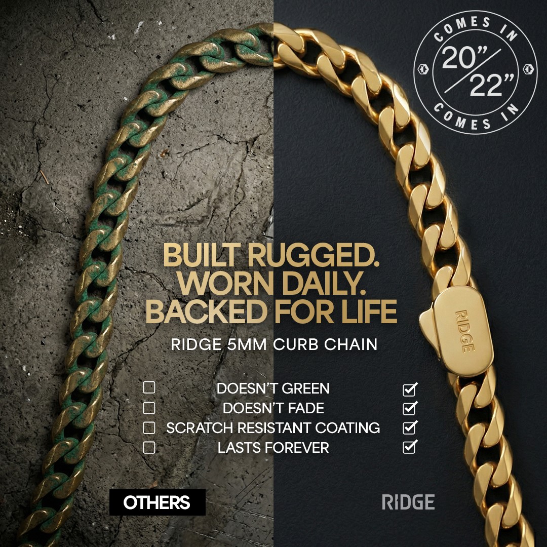

The Ridge
Us vs. Them
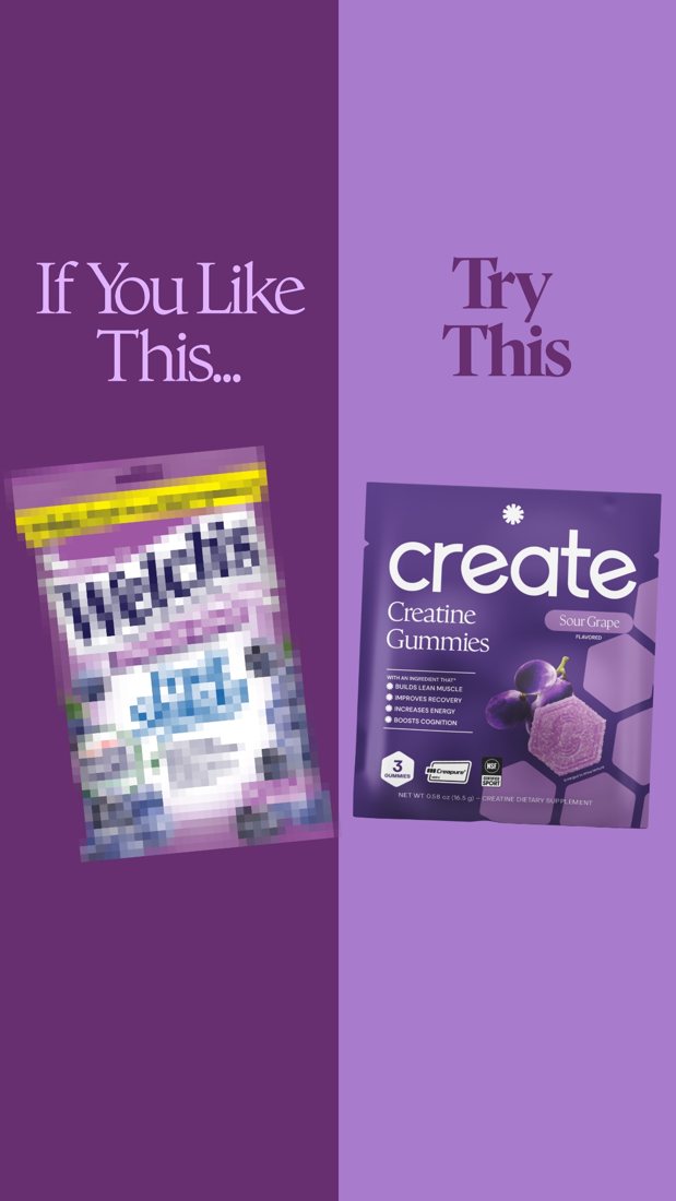

Try Create
Us vs. Them


Vitabiotics
Us vs. Them
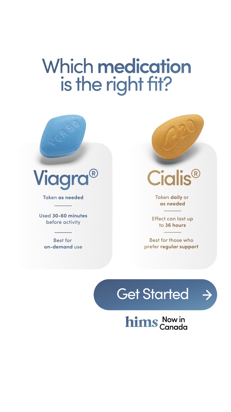

hims
Us vs. Them
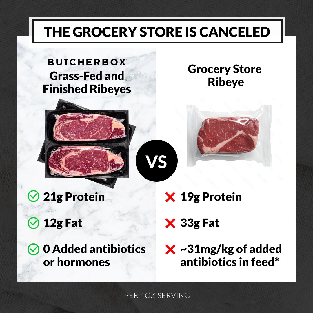

ButcherBox
Us vs. Them
Before you make yours
Compare the same things.
Use the same criteria on both sides. Pick differences that matter to the buying decision.
Make the contrast readable.
Line up the rows, crops and headings so the differences are easy to scan.
Bring support for every comparison.
Use current, verifiable facts for every product comparison.
Creative notes
Make the alternative visible.
The paired illustration makes the comparison visible before the reader inspects the details. Matching subjects keep the visual contrast focused.
View recipeUse parallel columns to explain the choice.
Parallel headings and short entries make the two approaches easy to compare. The main decision remains readable without a product photograph.
View recipeKeep the two sides on the same scale.
The repeated product view creates an immediate comparison. Color and hierarchy emphasize the preferred side, while the lists carry the factual differences.
View recipeMake one for your brand.
Add your product, audience and talking points to a creative recipe. Generate with Bassline or take the brief to your AI agent.