
Halsten
Us vs. Them ad example
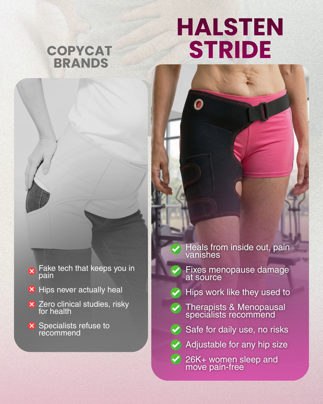
Two worn-product views occupy opposing sides of the frame. A muted left side contrasts with a colorful right side, and short lists sit beneath each view.
What to borrow
The repeated product view creates an immediate comparison. Color and hierarchy emphasize the preferred side, while the lists carry the factual differences.
For your brand
Use matched, permissioned photographs of your own product and an accurately represented alternative. Keep framing consistent and use only comparisons you can document.
Read the creative recipe
Creative recipe: Keep the two sides on the same scale.
Reference: https://usebassline.com/library/ads/examples/0582f959cb8dc5afca92a269a2547dc61548ed1d3d32363eb548bce130c40ef2
Source advertiser: Halsten
Format: Us vs. Them

Composition: Portrait layout divided into two product columns. Match the scale and crop of each product view. Distinguish the columns through restrained color and short, comparable labels.
Creative direction: Use matched, permissioned photographs of your own product and an accurately represented alternative. Keep framing consistent and use only comparisons you can document.

Before generating, ask me for:
1. Brand profile: logo, colors, fonts and voice.
2. Product: exact name, owned product images and verified details.
3. Audience: who this is for and the question or need to address.
4. Brief: goal, placement, aspect ratio and call to action.
5. Talking points: the one main message and facts that support it.

Use the reference for structure, not a copy of its artwork or wording. Keep my product identity accurate. Use owned or licensed assets and only supported claims. Do not invent testimonials, ratings, endorsements or performance numbers.
Draft the direction for my review. After I approve it, help me generate, revise and save my version.